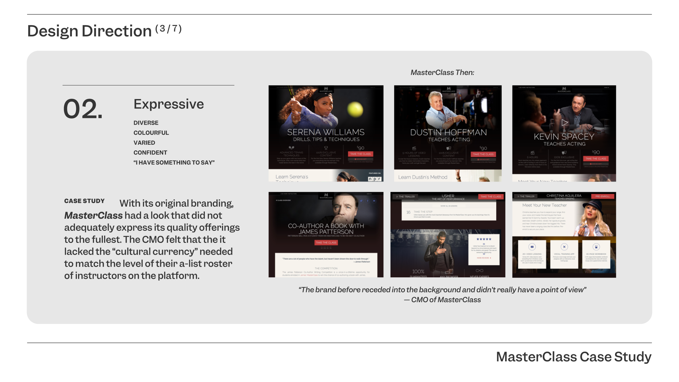
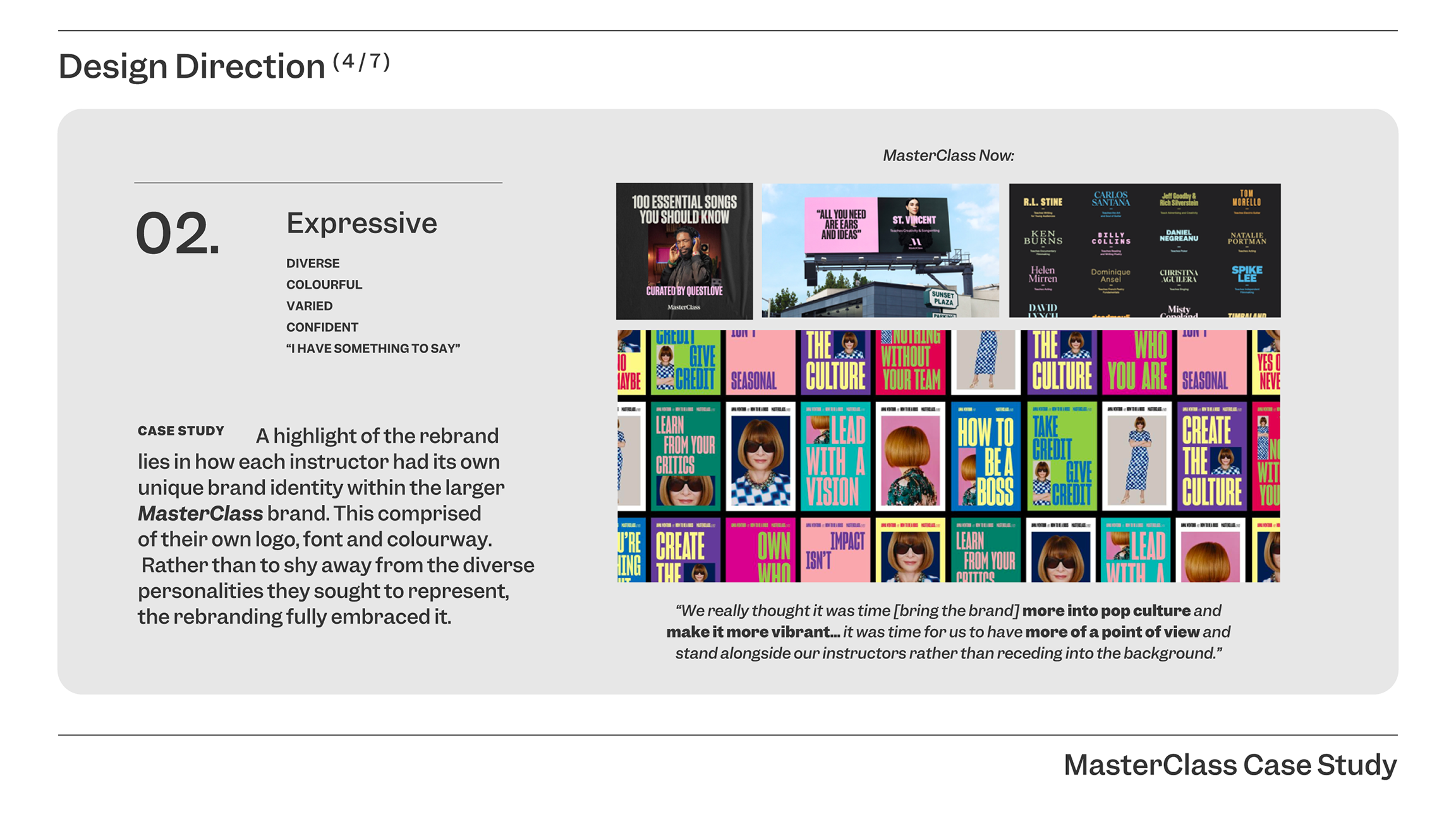
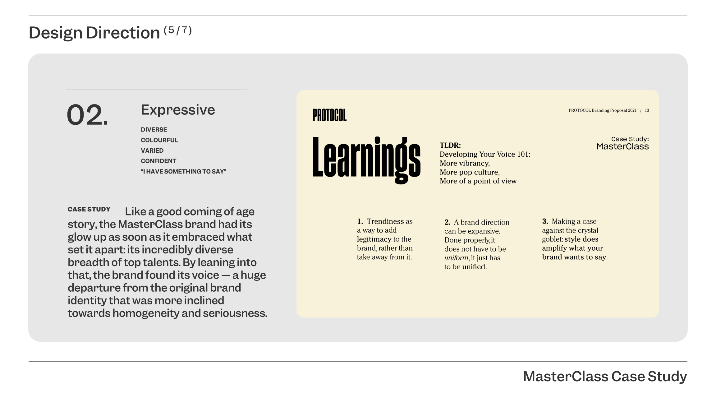
CASE STUDY
Rebranding:
PROTOCOL
CLIENT
PROTOCOLROLES
Art DirectionDesign
Brand Strategy
Copywriting
COLLABORATORS
Design adaptations
and coding:
Bryan Yu [1 & 4]
BRIEF
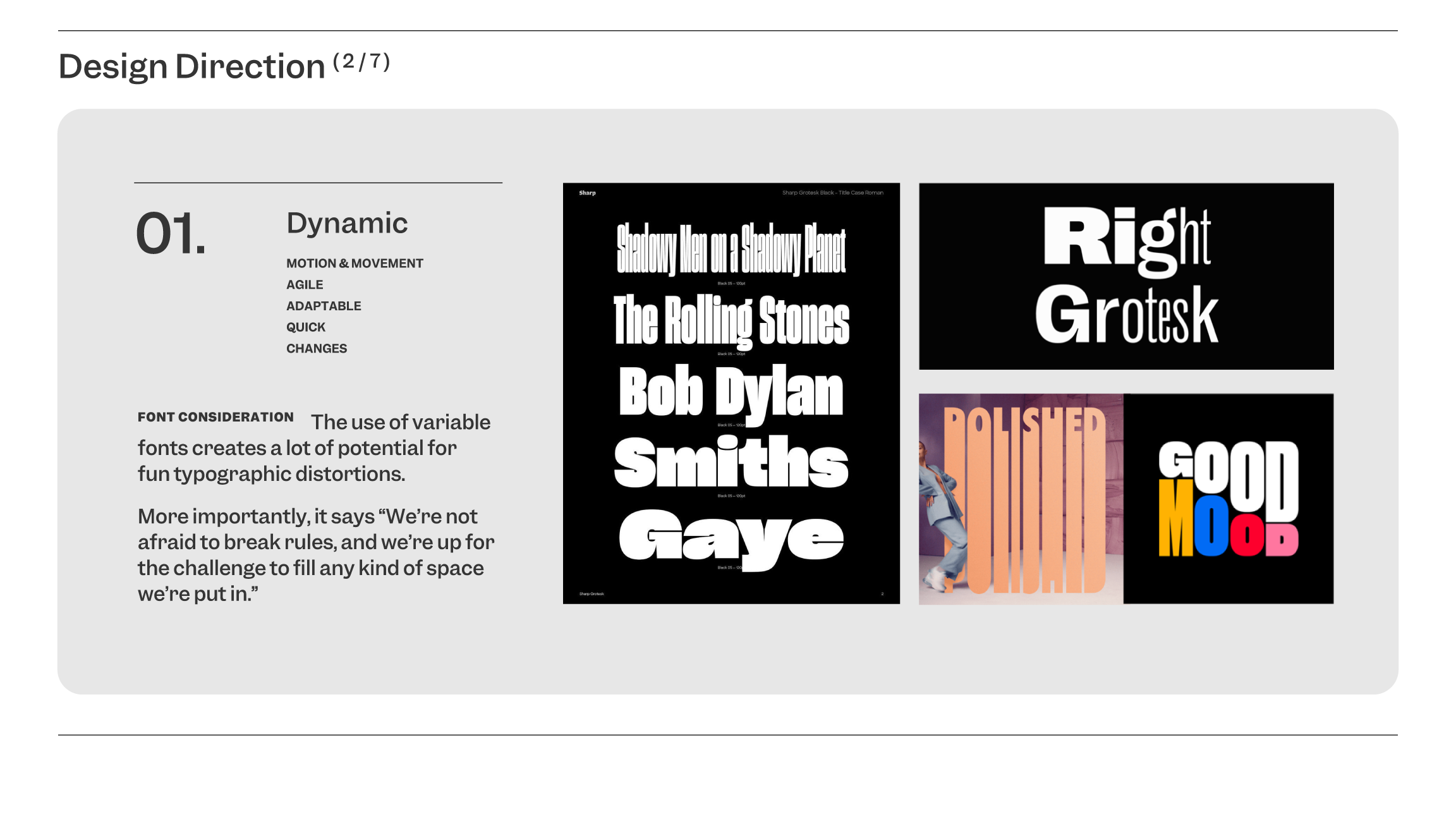
9 years after its inception, PROTOCOL’s original brand identity fit as well as our favourite pair of pre-pandemic jeans. The only thing the brand is keeping? Its values — strident, young, dumb, and great.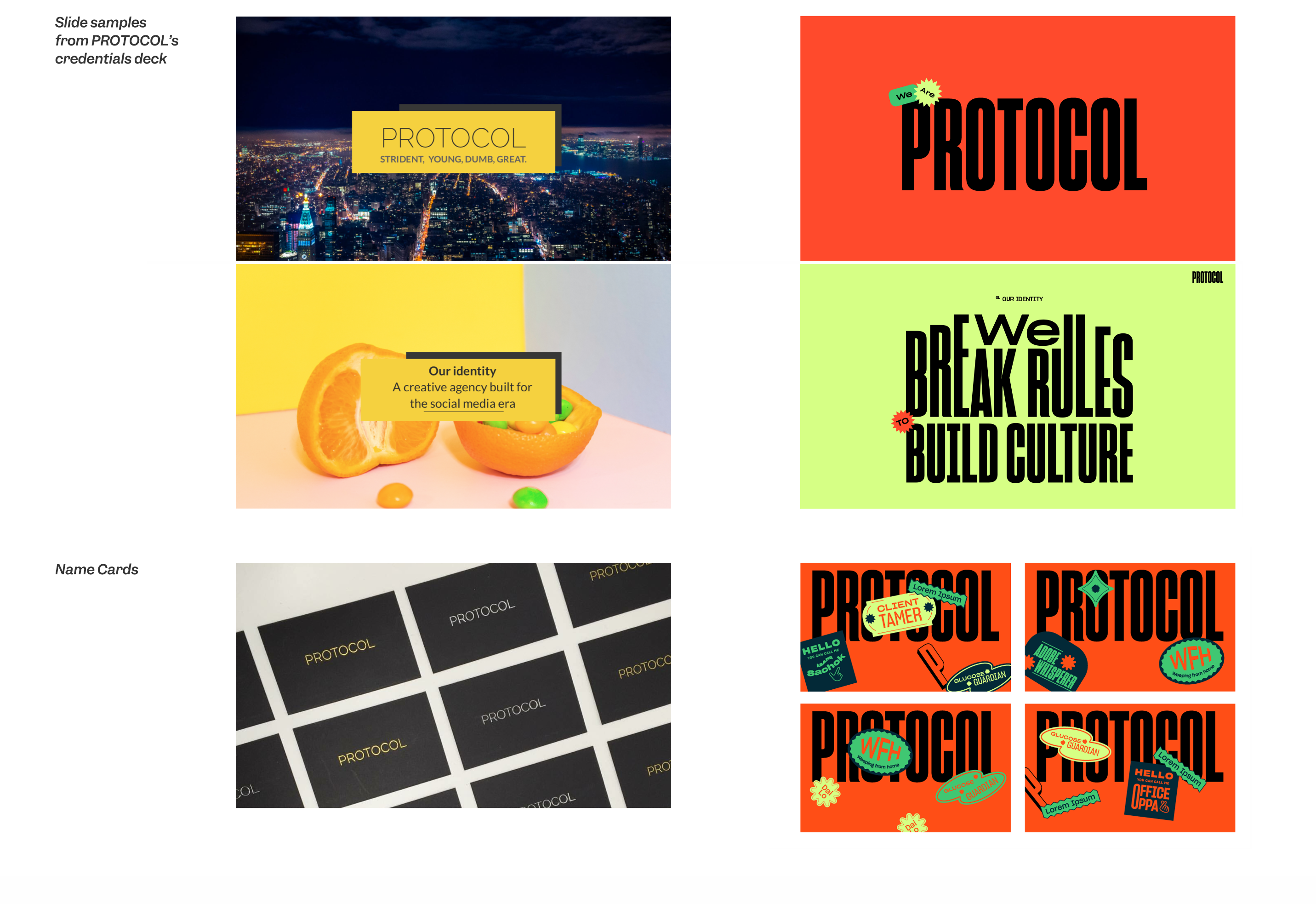
Solution
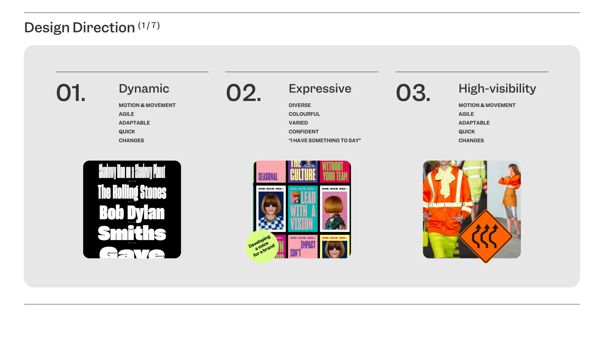
While the word “protocol” denotes something procedural and systematic,
the nature of people, creativity,
and even advertising is anything but. As a creative and social agency, PROTOCOL’s work and values often coloured outside the lines.
And yet, the original brand identity often erred on the side of solemness, favouring clean lines and a restrained typography treatment. It was quiet. This was in stark contrast to both the work and ethos of PROTOCOL, which fully embodied the spirit of being “strident, young, dumb, great.” It was what both clients and friends would remember best about the agency.
And yet, the original brand identity often erred on the side of solemness, favouring clean lines and a restrained typography treatment. It was quiet. This was in stark contrast to both the work and ethos of PROTOCOL, which fully embodied the spirit of being “strident, young, dumb, great.” It was what both clients and friends would remember best about the agency.
As the company approached its 9th year, it was time for PROTOCOL to truly own that, and to let the rest of the world know it too.
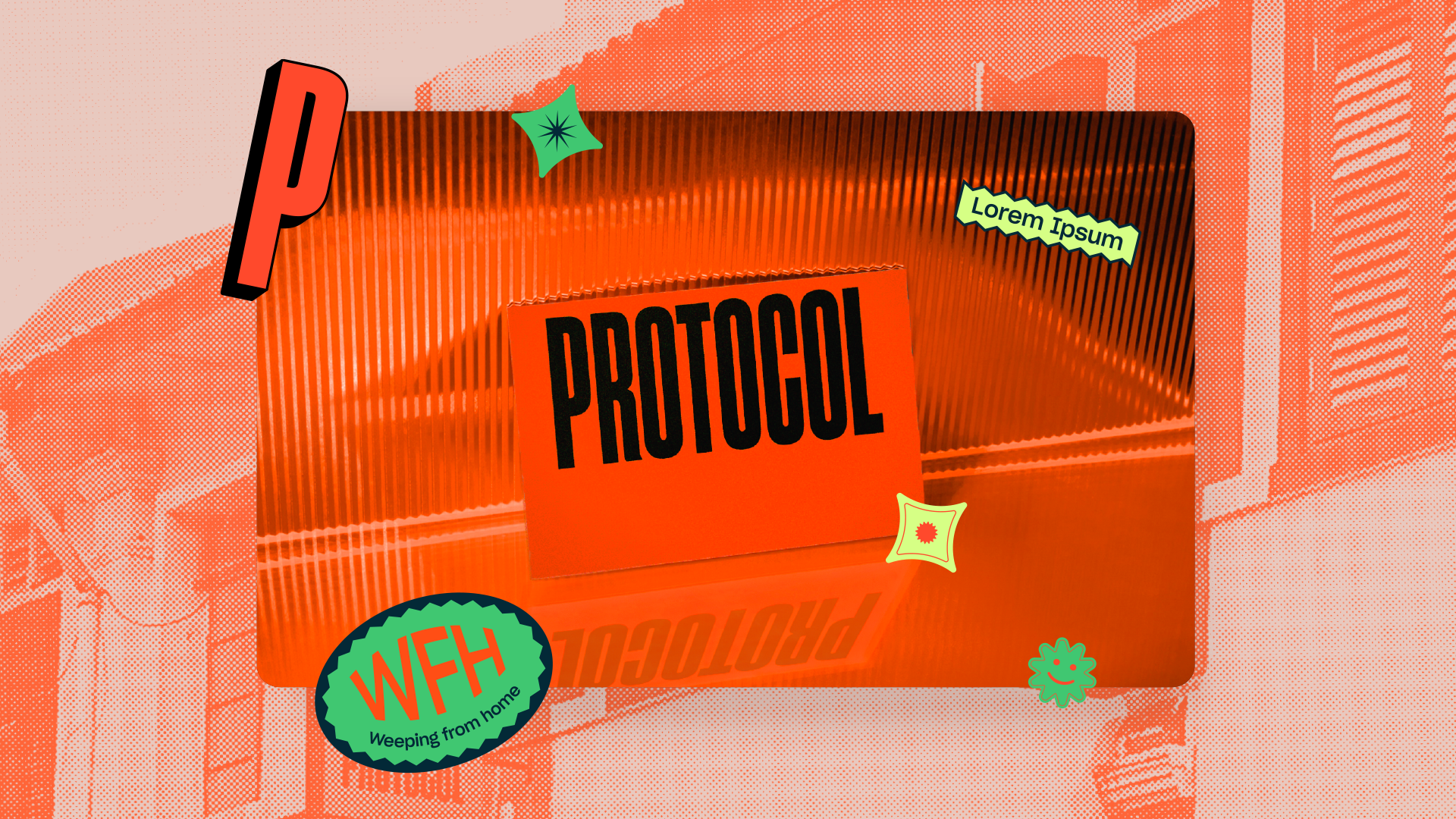
The new visual identity unapologetically leans into that. By turning the look of PROTOCOL on its head, the new identity looks more than ever.
The new visual identity unapologetically leans into that. By turning the look of PROTOCOL on its head, the new identity looks more
than ever.The following slideshow presents the adaptations of the original case study I created to explain my design decisions in my pitch to the senior management.
ᐸ
ᐳ
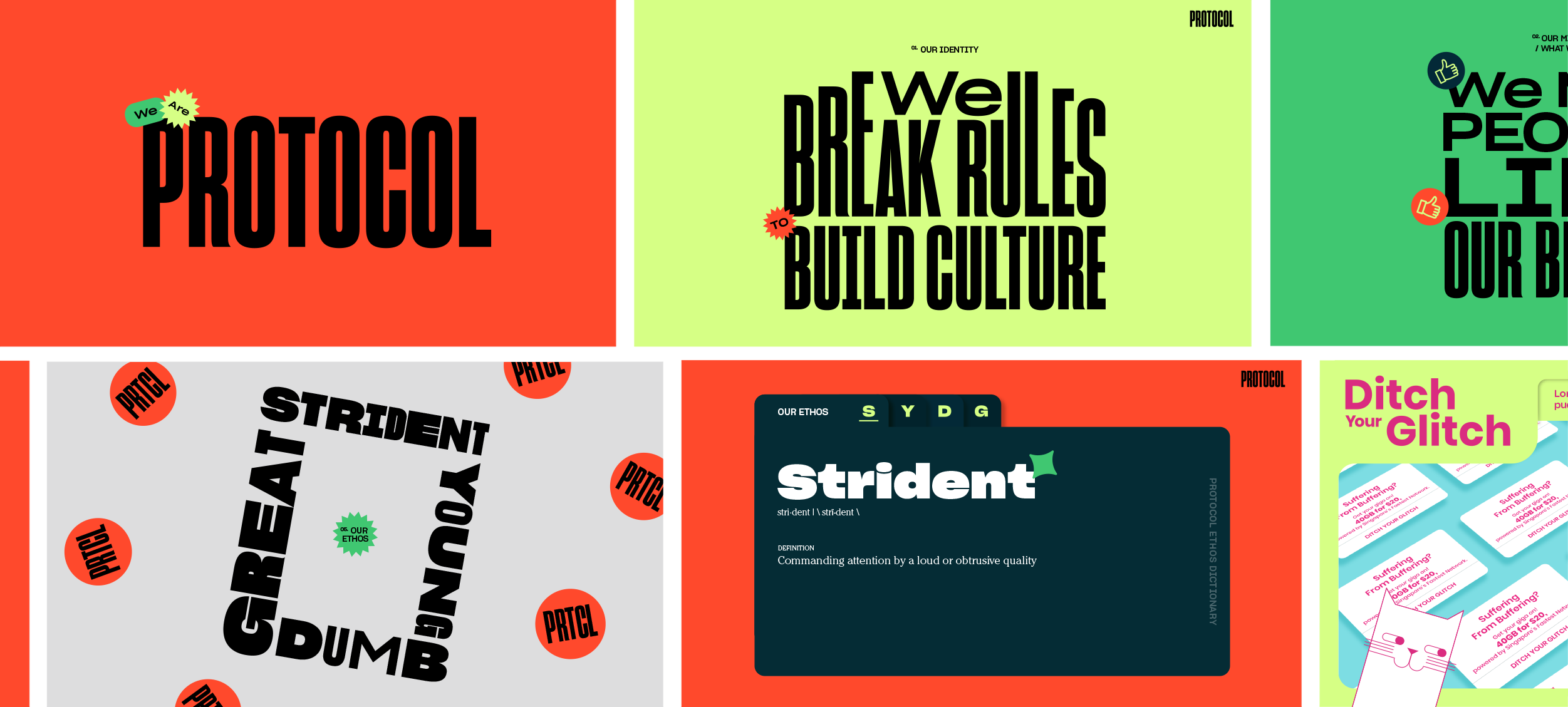
[1]Overview of PROTOCOL’s Stylescape
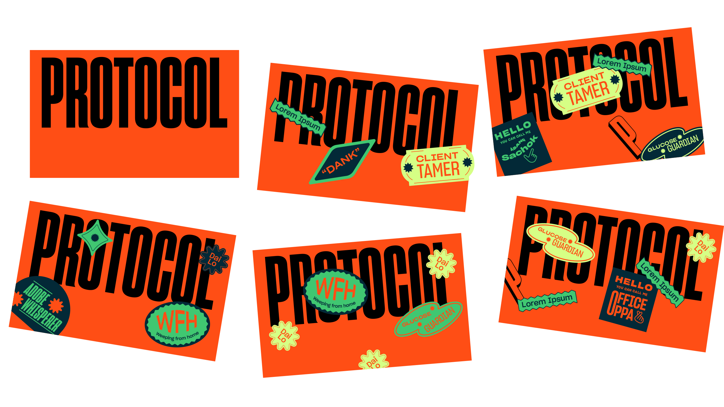
[2]Namecards
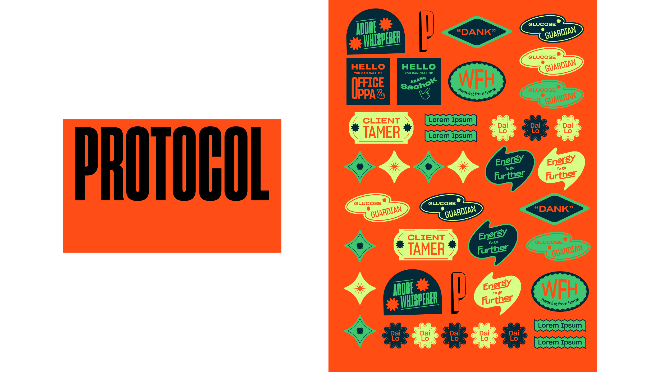
[3]Sticker Sheets
Customized
Namecards
For a brand that drew inspiration from its people, it made perfect sense to include them all in the branding process too. Not only does everyone get to customize their namecards with branded stickersheets, but the copy on the stickers is also a product of the team’s enthusiastic contributions.
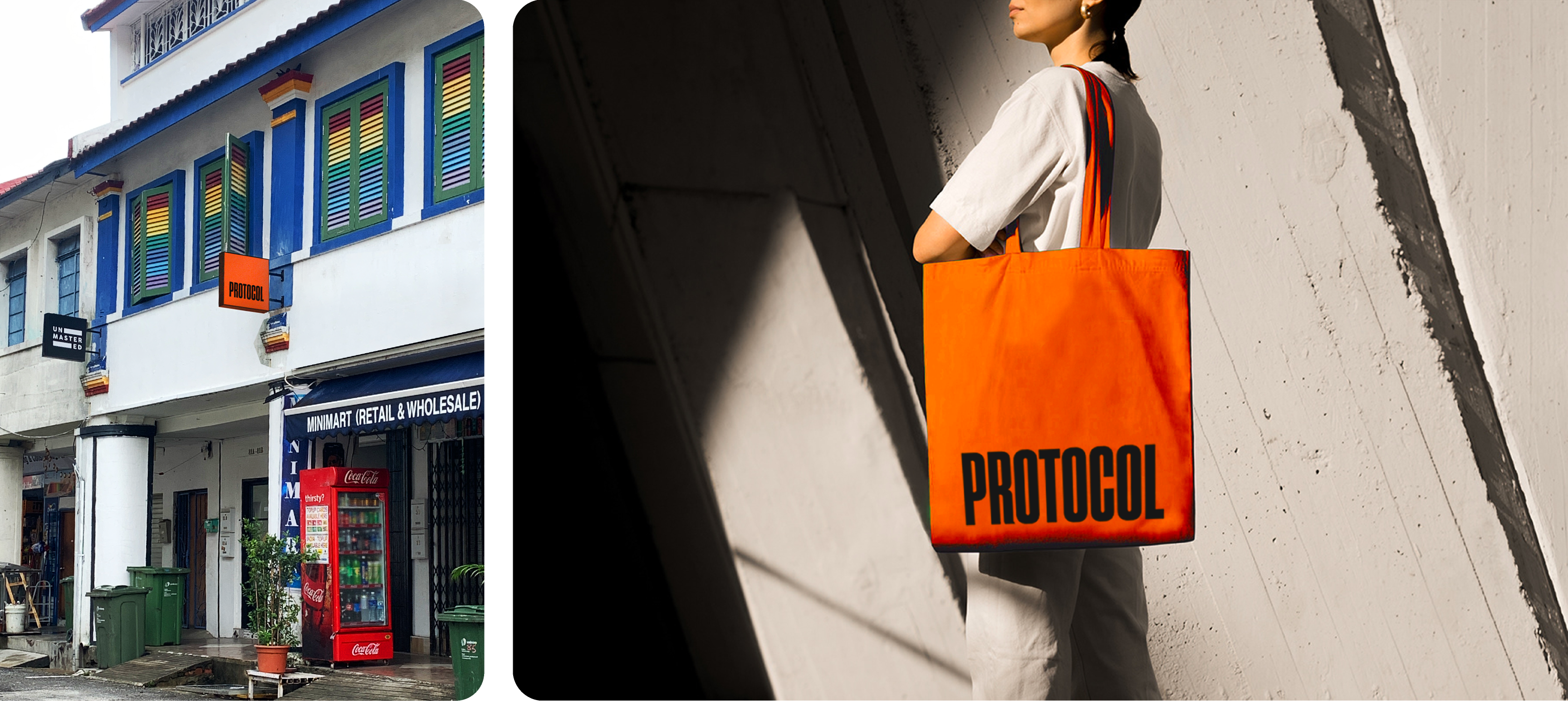
[4 & 5]Signage and Tote Bag
I made a lot of decks for this rebrand.
[5]Exhibit A: the first draft of the credentials deck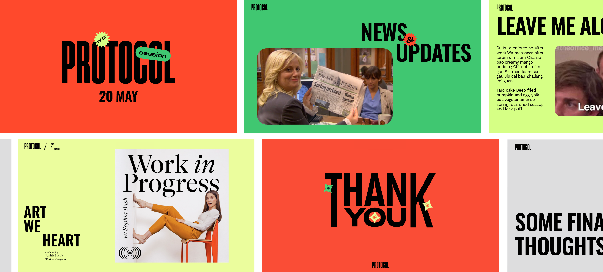
[5]Exhibit B: Google slides template for weekly Monday meetings.
The brand fonts have been swapped out for their closest Gslides-friendly substitutes in these templates.
The brand fonts have been swapped out for their closest Gslides-friendly substitutes in these templates.
from:
to:
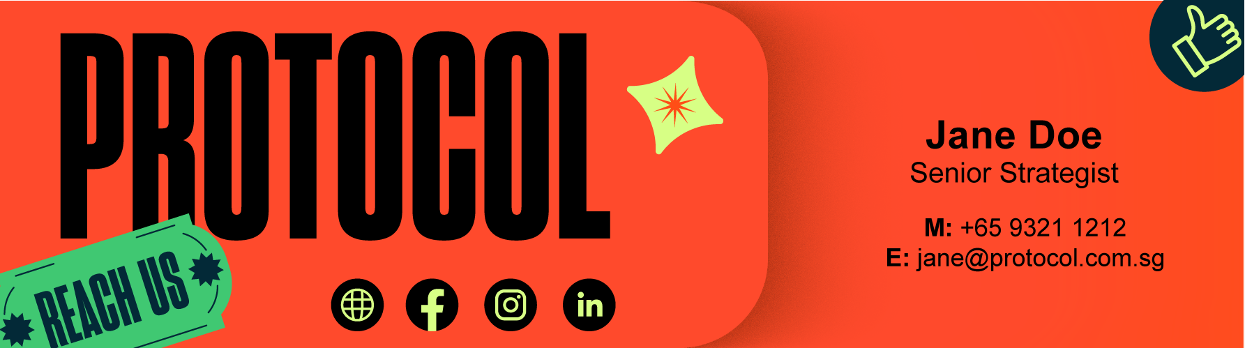
[7]We customized our e-mail signatures as well.
While I provided art direction and feedback, this e-mail signature template was coded by my colleague Bryan. Our goal was to make sure each user was able to fully customize the field for their personal details, hence we were limited to the use of Arial only.
While I provided art direction and feedback, this e-mail signature template was coded by my colleague Bryan. Our goal was to make sure each user was able to fully customize the field for their personal details, hence we were limited to the use of Arial only.
↘ CLICK TO SEE LIVE POST / ↘ IGS
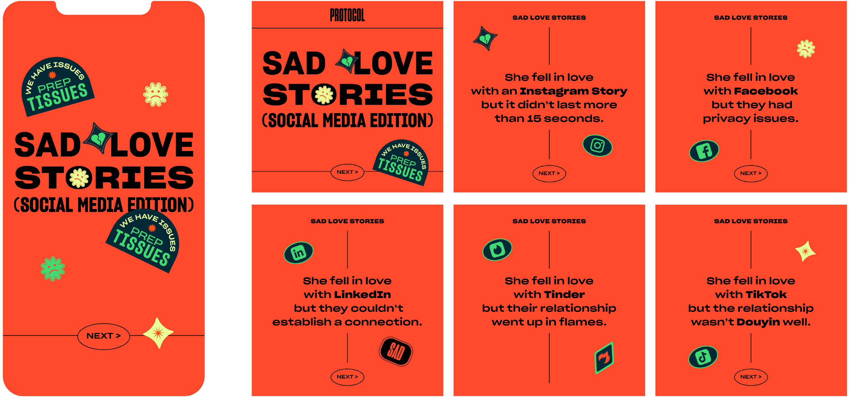
[8]Social Media Posts
Trendsjacking: #sadlovestories
↘ CLICK TO SEE LIVE POST
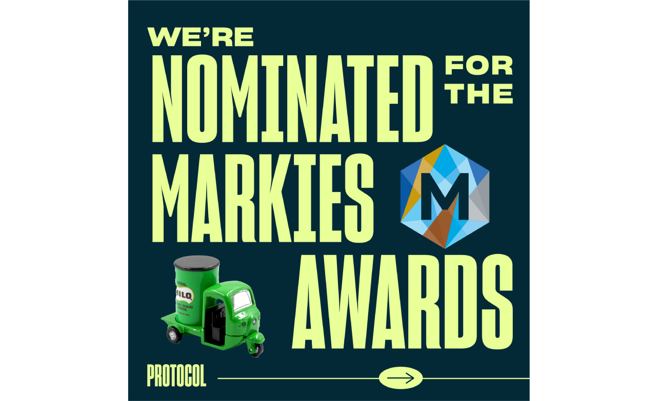
[8] Social Media Posts
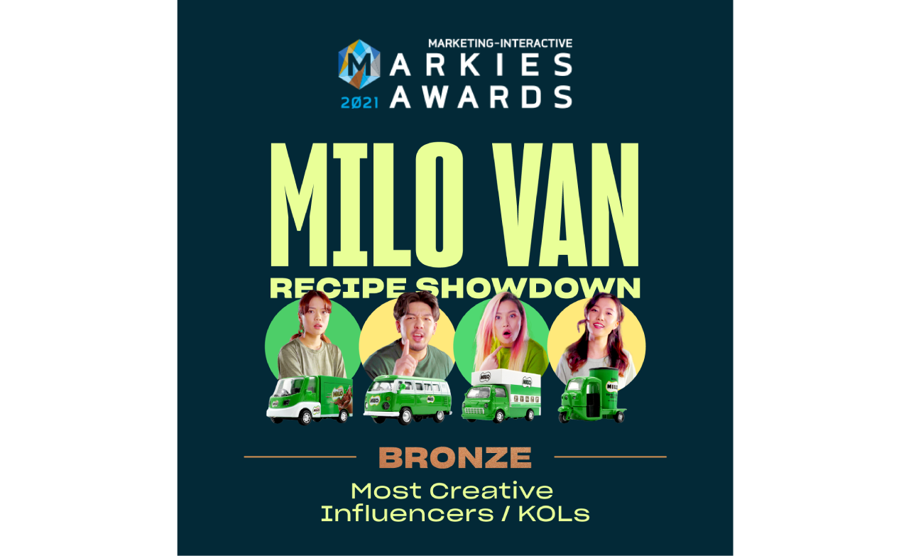
Visuals to Announce: 1. Our Award Nominations & 2. Subsequent Win
↘ CLICK TO SEE LIVE POST
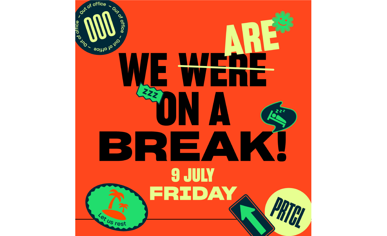
[8] Social Media Post
To inform clients and friends of the agency about the agency-wide break,
we could not resist making a reference to the iconic Friends line.